Image Rupture - Analogue
- Feb 9, 2021
- 5 min read
For this project I decided to use primarily prints of my own photograph rather than photos from magazines, because I wanted to have the option to rework or possibly replicate the exercise if I need to, and I tried to choose contrasting images for the Interventions.
Intervention 1 - I used one A4 black and white photograph of a silver birch tree (photo 1) and one 20 x 15cm colour photograph of some flowers (photo 2), and I cut into photo 2 to create a window in the shape of a dancer silhouette.
Final result -

When I placed photo 2 over photo 1 the silhouette revealed part of the tree trunk, though the body shape is still noticeable. I think this creates an interesting relationship between the body shape and the black and white tree which blend seamlessly and seem to be in harmony, maybe because of the colours of the two photographs.
Intervention 2 - For this one I chose one photograph of a cut tree trunk (photo 1) which I found very interesting as it has some organic material growing in it, a photograph of an old silk weaving machine (photo 2). My idea was to play with two very contrasting subjects, one very organic and one very industrial. I removed most of the background of photo 2, leaving mainly the metal shapes of the machine, and I placed it on top of photo 1

Intervention 3 - Paint out a section on the top of my image.
For this experiment I used a photo I took a couple of years ago of the area around Fleet Pond, and I placed a piece of recycled packaging with round shapes on top. I then painted the negative space of it with gold acrylic with the idea of combine two totally unrelated things.
My first response to the result was disappointment, as I would have loved to have had cleaner edges to the round shapes, and it was difficult to find any meaning in it, though I think the gold does harmonise with the light falling on the trees. Initially therefore, I felt it was a failed exercise, but as the time passed It grew on me. I still have a problem with the rough edges however, which are badly done, and I wish I had taken more care when I was doing it - I really prefer to see cleaner lines in my work.

Intervention 4 - Stich over with coloured thread
I was not very keen to do this intervention. Although I like embroidery as craft, the mixture of paper with fabric or thread didn’t appeal to me, firstly because I feel that the roughness of the thread and the silkiness of the paper don’t go well together, and secondly because there’s a high risk of tearing the paper when inserting a needle in it – which feels somehow unpleasant to me.
Having said that, I do like the work of Julie Cockburn because of the geometrical shapes and combinations of colours she uses, and I admire her skill in being able to embroider onto old photograph so seamless. What I didn’t know at the time of my intervention is that she sticks the original to a piece of fabric in order to avoid the needle tearing the paper, but I still think what she does is impressive.

For the intervention I used an A4 photo print of the back of a garden chair because I liked the contrast of colours between the chair and the flowers in the background, and also because I happened to have some thread in my hobby box which matches the colours.
To minimise tearing the paper with the stiches I decided to weave geometric random shapes in different parts of the photo rather than embroider, though I still tore the paper a little, especially on the circular shapes, as the stiches had to be closer to each other.
My final result -

Intervention 5 –
To my surprise, having enjoyed the process of weaving into the photo in Intervention 4, and inspired by Julie Cockburn’s portraits, I decide to try the technique on a portrait. Although she normally chooses portraits with plain light backgrounds, I chose a portrait of a young woman on a dark background from a photography book - mainly because I like the colour of her blue eyes in contrast with the orange of her lipstick.
My first idea was to create an unusual shape which more or less conceals most of her face, and I began by scanning the picture and printing it on inkjet photopaper, and to decide the shape of my intervention on her face I played with a Flexible Curve tool.
To avoid the needle tearing the paper I placed a piece of semi-transparent Ikea anti-slip carpet underlay on top of the image to serve as a guide and inserted a piece of A4 paper cut on the shape of my chosen pattern between the image and anti-slip underlay.
My initial intention was to weave the image in two parts - the one on the right in different shades of blue, harmonizing with the colour of her eyes, and the one on the left in orange, harmonizing with the colour on her lips, leaving the central part untouched, showing part of her face. As I was doing it, however, I started liking the unfinished feel of the weaving on the face, so I decided to stop there, and I thought if I went on it would look crowded.
My final work -

video documenting the process - https://youtu.be/iHKUeQ2scWE
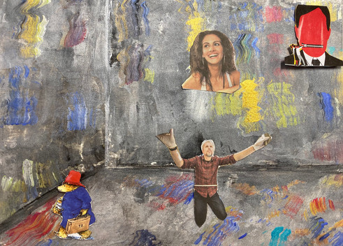
Other Interventions


Reflection on the tasks and Group crits
When I heard the term Image Rupture I felt uneasy, because the word ‘rupture’ implies violence or cruelty. Reflecting on the concept however, rather than meaning to violate an image it can indicate intrusion or disturbance of an image, to create something new – to explore the unknown – without involving brutality or cruelty, which made me feel better.
The reaction of the group to my work was the diversity of themes and the diversity of materials I use, but the fact is that I don’t force myself in any particular direction, it just happens. I like many things and I get excited with the variety of things I can experiment with, and so to focus on any one particular theme doesn’t come natural to me.
I’ve asked myself many times whether the diversity of my work is a positive or a negative thing – whether I should force myself to narrow down my subjects – and maybe this will come at some point during the course. At the moment however I’m happy to proceed with what comes naturally and see what happens as I go on.
It was also noted that there was a sense of acceptance and non-violence in my work, which I accepted. I think there’s a lot of negativity in the visual art world – a strong element of protest and violence against injustice, against consumerism, capitalism vs communism etc. My view however – and this may be reflected in my work – is that things can change for the better if more positive ideas are emphasised, and that we should use our energy and hard work in more efficient ways.
Comments