Head and shoulder portrait
- Jul 29, 2019
- 4 min read
I did this exercise mainly in my life drawing class, which had both advantages and disadvantages: on the plus side I didn’t need to hire a model which would have been quite expensive, and I had guidance and ideas from the tutor. I didn’t however have the freedom to choose the timing of the pose. The tutor very kindly tries to accommodate my needs most of the time but I would have loved to have had longer to paint, and as taking photographs isn’t allowed, I always end up with unfinished work.
The other disadvantage is that due to health issues with some of the people in the class I couldn’t use the mediums available for WMO because of the smells, even though they smell less than with traditional oils. I couldn’t therefore experiment as much as I would have liked, and was restricted to using charcoal and watercolour or neat WMO mixed with water.
I show below a selection of head and shoulder portraits I did in the class, and more can be seen in my sketchbook.
1. A 20-minute pose with charcoal on A2 mixed media paper.

I quite like this drawing because I think I achieved a good likeness of the model and my lines are long and more confident than usual.
2. A 30-minute pose in Modigliani style in watercolour on A2 mixed media paper
One of the things that surprises me most about Modigliani is his ability to capture likeness despite his signature distortion of the features: long neck, small mouth, almond eyes.

I was pleased with the result of the exercise even though unfinished, because I did achieve a fair likeness of the model as well as capturing something of Modigliani's style.
3. A 30-minute pose using neat WMO on 50 x 40cm oil paper

4. A 30-minute pose using WMO and water on 50x40 oil paper

5. Experimenting with wide brushes
I always felt that I needed to learn to be freer and bolder with my work, and needed to come out of my comfort zone, and there are two living contemporary portrait artists whose work I really like: Jonathan Yeo and Tim Benson. I really admire the looseness of Tim Benson’s work and his ability to capture the expressions and feelings of his sitters with very broad brush strokes. For the exercise I attended his Expressive Portrait 1-day painting workshop at The Heatherley School of Fine Art in which he explained how he uses only a single brush: normally No 14, and a quite limited colour palette.
http://timbenson.co.uk/faces-of-ebola/
I did two 30-minute warm-up sketches, firstly using A4 recycled cardboard primed with Plextol 498, a No 8 Filbert brush, and Cadmium Red, Alizarin Crimson, Lemon Yellow, Ultramarine Blue, Burnt Umber, and Titanium White as my colours.

In doing the first sketch I realised the importance of including some of the background as negative space to define the edges of the face, and found that Plextol 498 was not suitable for priming as the paint did not run smoothly. Although this was a quick sketch I did get some likeness of the sitter, and I also like the blocky, interrupted effect of the brush strokes.
I did the second sketch on 35 x 27 cm pre-primed canvas board using a No 8 Filbert brush, with Cadmium Red, Alizarin Crimson, Lemon Yellow, Ultramarine Blue, Burnt Umber, and Titanium White as my colours.

This time the result was quite muddy though I did get the impression of the beard - especially difficult with a big brush. I think the angle of the face is not quite right though I did get something of the likeness of the sitter.
The final sketch was a two-hour pose, and I decided to go as big as I could with the face so I used a 50 x 60 cm canvas board which I tried to fill entirely with the face. I used a No 14 filbert brush with Cadmium Red, Alizarin Crimson, Ultramarine Blue, Burnt Umber, and Titanium White WMO as my colours
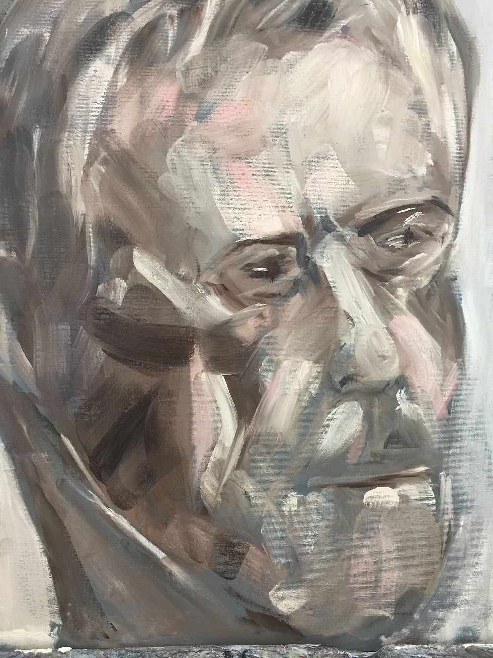
My conclusions on the exercise are that in general it was a real challenge not to go into detail or smooth and blend the paint as I normally do. I also found it difficult concentrating to try to identify the blocks of colour on the sitters’ faces in order to build up the faces with wide brush strokes – very difficult to determine the limits of the blocks of colour in the faces.
Due to the limited space in the room and the large size of my painting it was difficult to step back enough to check properly the likeness and proportions against the sitter, and though I’m not very happy with the result I learned a lot from the experience. I don’t think this will ever be my preferred style of painting, but it’s worth practicing the technique as I’m sure it will be useful as a starting point for portraits, and I can go into detail later using other techniques in combination.
6. Experimenting with texture
I based this exercise on a very small photo of a ballerina and my intention was to experiment using Liquin Impasto to create texture for oil painting

To experiment with support I used A3 watercolour paper upon which I had printed a photograph of a stone which, due to a malfunction of my printer had come out quite green. I was nevertheless curious to see if the green background could be of any use in the painting so primed the paper with clear primer. I found however that as the painting evolved the green background almost disappeared except for the edges where the masking tape was.

My intention was to create contrast and texture, so I decided to make the flesh areas smooth using a brush and a rag, and create texture on the (invented) dress and background using an old credit card to apply the paint.

Although the face needs refinement and more detail and I’m not entirely convinced with the background, I’m happy with the final result - I like the smoothness and the unfinished effect of the flesh and the effect on the dress
Comments